70: The Jinn
Feb06
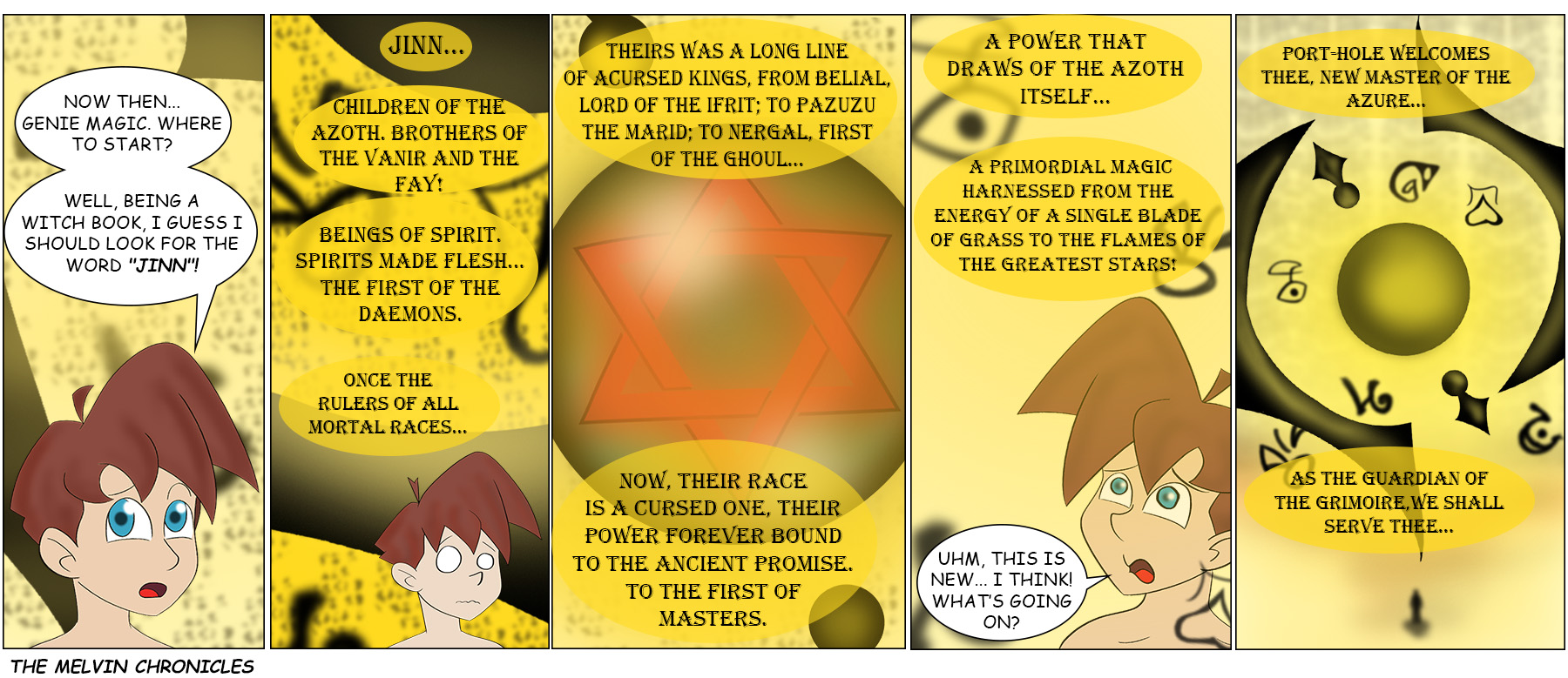
Well, well. Port-Hole is being rather forthcoming with some very important historical information.
As many noticed, the font we chose for Port-Hole on last week’s page was… mildly illegible. It was even worse on today’s page, so we decided it needed to change. We found an alternative that still gets the “fanciness” across, without being so hard on the eyes and the brain… heh. We’ve retroactively updated last week’s page with the new font, too.

Ok…. So Pazuzu, the demon lord of the southwest wind was a Marid?
How exactly did that happen?
Also Port-Hole’s statement about the Jinn is technically correct, as the Jinn were beings born of smokeless fire given flesh and form.
It’s a good choice, thanks. 🙂
And then Melvin says: mmm what is this and what going on here? You didn’t answer my question about the Djinn.
I am highly disappointed that the Wikipedia entry on “Nergal” includes no mention of the sub-light battleship of that name.
https://en.wikipedia.org/wiki/Nergal_%28disambiguation%29 … there is some battleship there.
Alas, the only relevant page linked there (https://en.wikipedia.org/wiki/David_Weber) has no mention of this ship, either. Though one of the books in that series is mentioned. ^_^
Oh dang, you like Empire from the Ashes, too? That’s my favorite Sci-fi series!
You could say that, yes. I have the three paperback editions floating around here somewhere, and I have the Omnibus edition on my Kindle Fire, and I reread it every now and then. Last time was last month. ^_^
I’ve been reading David Weber ever since my brother introduced me to a quick&dirty tabletop space combat game called “Starfire”.
I’m fairly certain that Heirs of Empire sprang from the same seed as the Safehold series.
Djinn, no chaser.
Perhaps he should take a tonic
Wait, it was supposed to be legible? I tought the text on the previous page was just for effect.
The text in the background was for effect. The speech bubbles were supposed to be legible.
Illegible Fonts…
ROFL !! To illustrate my fun ‘WIRS’ SciFi tale, “The Heptonstall Horror”, I crafted a very convincing document in a hyper-ornate, Arabic-ish font that I bought in.
This totally threw readers.
I had to explain that, if you turned the document upside-down and sorta squinted at it skew, it was revealed as a famous song’s repetitive lyrics, in ENGLISH, exactly as my bemused protagonist belatedly figures…
But, for utter impenetrability, I still shudder at memory of some Uni syntheses, their classic ‘retro’ recipes writ in High German, printed in eye-watering ‘Old Fraktur’. Regardless of complexity, such only had three sentences: First, a short intro. Second, the work, which often ran to several pages, with ALL the verbs at the end. Third, a short summary.
As a foe, think ‘Extreme Sudoku’ or manually combing out then documenting really, really snarled ‘Spaghetti Code’. We joked translation often took longer than the synthesis itself…
😉